

 English
 Lietuvių
 Latviešu
 Eesti
Eesti Русский
 Polski
 Українська
 Deutsch
 Italiano
 Español
 Français
 Português
 Čeština
 Magyar
 Română
 Ελληνικά
 Türkçe
 日本語
日本語 العربية
 हिन्दी
 Bahasa Indonesia
 Bahasa Melayu
 ไทย
ไทย Tiếng Việt
 বাংলা
বাংলাMobile-First Web Design: What Business Sites Get Wrong on Phones
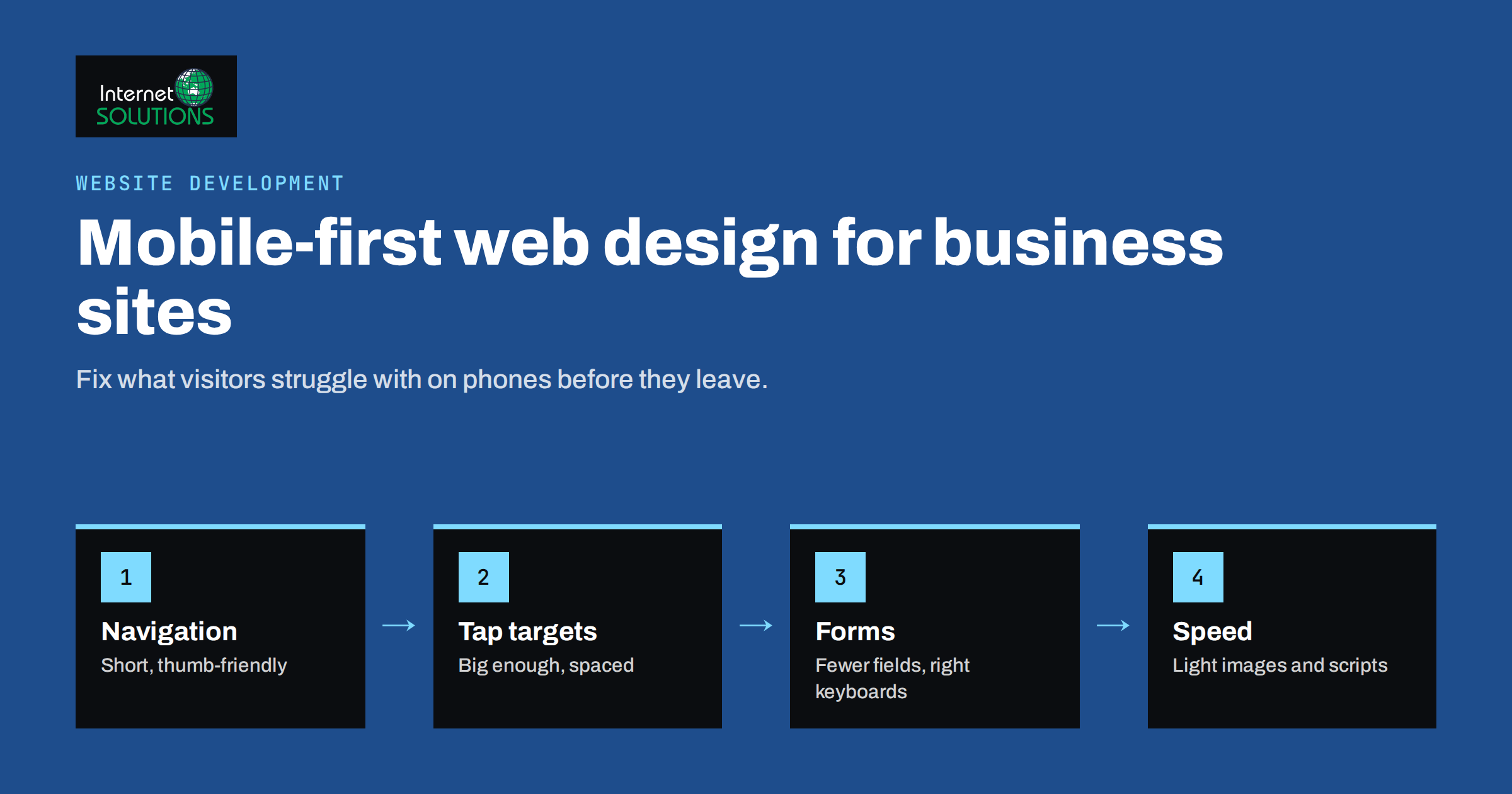
Mobile-first web design means planning a website for the small screen first and then expanding it for larger ones, rather than designing for a desktop monitor and squeezing the result onto a phone. For most business websites, phones now bring a large share of visitors, often the majority. Yet many sites still treat mobile as an afterthought: menus that need three taps to reach a service page, forms that are painful to fill in with a thumb, images that take seconds to load on a mobile connection and contact buttons hidden at the bottom of long pages. Visitors rarely complain. They simply leave and choose a competitor whose site works.
This article covers the mobile-first web design problems we see most often on business sites, why they matter for both conversions and search, and how to test and fix them. It is aimed at business owners, marketers and developers who want their website to work well where most visitors actually use it.
Why Mobile-First Matters More Than Ever
There are two reasons to take mobile design seriously, and both affect revenue.
The first is behaviour. Many people discover businesses on their phones: they search on the way somewhere, tap a link in a social post or open an email on the sofa. If the mobile experience is frustrating, that first visit ends quickly. Even visitors who later buy on a desktop often form their first impression on a phone.
The second is search. Google now uses the mobile version of a page for indexing and ranking, a practice it calls mobile-first indexing. Its mobile-first indexing best practices make the consequence clear: content, structured data and metadata that exist only on the desktop version may not be considered at all. A site that hides text, links or images on mobile to save space can lose rankings for content it believes it has.
Speed matters too. Page experience signals such as the Core Web Vitals are measured on real devices, and mobile devices with slower processors and connections expose heavy pages most clearly.
Mistake 1: Navigation Built for the Desktop
Desktop menus with many top-level items and large dropdowns rarely translate well to phones. On mobile they become long, nested accordion lists inside a hamburger menu, and visitors give up before finding the page they want.
Better approaches:
- Prioritise. Decide the three to five destinations most visitors need, typically main services or categories, pricing, contact, and make them reachable in one or two taps.
- Keep a visible call to action. A “Call” or “Get a quote” button in the header, visible without opening the menu, is often the most used element on a mobile business site.
- Use clear labels. “Services” is better than a clever brand name for the same page.
- Add search on sites with many pages, such as shops and knowledge bases.
- Avoid hover-only interactions. Phones do not hover, so menus or tooltips that depend on it simply do not work.
Mistake 2: Tap Targets That Are Too Small or Too Close
Links and buttons sized for a mouse pointer are hard to hit with a finger. Visitors tap the wrong link, zoom in to try again or give up. The Web Content Accessibility Guidelines include a success criterion on minimum target size, and the design guidelines of the major mobile platforms recommend even larger touch areas, typically around 44 to 48 pixels.
Check especially:
- Text links inside paragraphs that sit close together.
- Icons without labels, such as social media or close buttons.
- Footer links stacked tightly.
- Pagination and filter controls in online shops.
- Checkboxes and radio buttons in forms, which should be tappable on their label as well.
Generous spacing also benefits users with motor impairments, which is one of the many overlaps between mobile usability and accessibility. Our guide to website accessibility and WCAG compliance covers the wider requirements.
Mistake 3: Forms That Fight the Thumb
Forms are where mobile visitors convert, and also where many give up. Common problems include too many fields, labels inside fields that disappear when typing, tiny dropdowns, wrong keyboards and error messages that appear only after submission.
| Problem | Why it hurts on mobile | Fix |
|---|---|---|
| Too many fields | Each field means typing on a small keyboard | Ask only for what you need to respond; collect the rest later |
| Wrong keyboard | Letters keyboard for a phone number slows input | Use input types for email, phone and numbers |
| Placeholder-only labels | Label vanishes once typing starts | Use visible labels above fields |
| No autofill | Users retype details the phone already knows | Use standard autocomplete attributes |
| Late error messages | Users scroll to find what went wrong | Validate inline, next to the field |
| Hard puzzles against spam | Image challenges are painful on small screens | Use invisible or lightweight spam protection |
| Small submit button | Easy to miss, sometimes below the keyboard | Full-width button with a clear label |
For lead generation, also make sure that the confirmation after submission is clear and that the lead actually arrives. Our article on contact forms and lead notifications covers the technical side.
Mistake 4: Images and Media That Weigh Too Much
Large hero images, sliders with several full-width photos, autoplay videos and background animations look impressive on a fast office connection and painful on a phone with a weak signal. The fixes are well known but often skipped:
- Serve responsive images so phones download smaller versions instead of desktop-sized files.
- Use modern formats such as WebP or AVIF and compress sensibly.
- Lazy-load images below the first screen, but not the main image visitors see first.
- Drop sliders. Visitors rarely see beyond the first slide, and each slide adds weight.
- Avoid autoplay video on mobile, or use a light poster image that loads the video only on tap.
- Reserve space for images and embeds so content does not jump while the page loads.
Our guide to website speed and Core Web Vitals explains how to measure and prioritise these improvements.
Mistake 5: Content Hidden or Reordered Badly
To keep mobile pages short, some designs hide content behind tabs, remove sections or move key information far down. Hiding everything is harmful, both for users who need the information and for search engines that index the mobile version. At the same time, a desktop layout simply stacked into one long column often puts the most important message far below the fold.
A mobile-first approach asks what visitors need first on a phone. Usually that is: what you offer, for whom, why they should trust you and how to take the next step. Put those elements at the top in that order. Accordions are acceptable for secondary details such as frequently asked questions, as long as the content is present in the page and accessible.
Mistake 6: Text That Is Hard to Read
Small body text, low-contrast grey on white, long lines and tight line spacing all make reading on a phone tiring. Use a comfortable base font size, sufficient contrast, short paragraphs and clear headings that let readers scan. Avoid text embedded in images, which cannot be resized, translated or read by screen readers, and often becomes unreadable on small screens.
Mistake 7: Pop-Ups and Sticky Elements That Cover the Page
Cookie banners, newsletter pop-ups, chat widgets, sticky headers and promotional bars can together cover a large part of a small screen. Each one may seem reasonable on its own; combined they make the page unusable. Google has also warned for years that intrusive interstitials, which block content on mobile, can affect how pages are evaluated.
Practical rules:
- Keep the cookie banner compact and easy to dismiss.
- Delay newsletter prompts until a visitor has engaged with the content, and make them easy to close.
- Use a compact sticky header, or one that hides while scrolling down and reappears when scrolling up.
- Make sure chat buttons do not cover form buttons or important links.
Mistake 8: Phone Numbers and Addresses That Do Nothing
On a phone, a visitor should be able to call with one tap, open your address in a map app and send an email without copying text. Phone numbers should be clickable links, addresses should link to a map, and opening hours should be easy to find. For local businesses, these small details often decide whether a visitor contacts you or the next result.
Mobile Checkout for Online Stores
For e-commerce, the checkout is where mobile problems cost the most. Offer guest checkout instead of forcing account creation, show the total including delivery early, support the wallet and payment methods your customers use on phones, keep the number of steps low and make the order summary easy to review on a small screen. Every extra field or surprise cost at this stage loses orders that the rest of the site worked hard to win.
Testing on Real Devices
Browser developer tools can simulate phone screens, and they are useful during development. But simulations do not show how a page feels on a real device with a real network. A simple testing routine:
- Test on at least two real phones, ideally one recent and one older or lower-end model, on both major mobile platforms if possible.
- Use a mobile connection, not office Wi-Fi.
- Complete real tasks: find a service, read a price, fill in the contact form, call, add a product to the cart and check out.
- Use one hand, as many visitors do.
- Watch someone else try. A colleague or friend who does not know the site will find problems you no longer notice.
- Check analytics for mobile bounce rates, conversion rates and page speed compared with desktop.
For paid campaigns, test landing pages on mobile before increasing budgets, because most ad clicks may come from phones. Check the landing page first, then the ads.
Mobile-First in a Redesign or New Build
If you are planning a new website, mobile-first should shape the process from the start:
- Sketch and approve mobile layouts first, then expand to tablet and desktop.
- Write content in short sections with clear headings, which works on every screen.
- Set a performance budget for page weight and scripts before design begins.
- Choose components such as menus, tables and forms that have proven mobile patterns.
- Include mobile testing in every review round, not only at the end.
Our website development team designs websites and online stores to the client’s requirements, with layouts that are agreed and reviewed together before the site goes live.
Frequently Asked Questions
Is responsive design the same as mobile-first design?
Not exactly. Responsive design means the layout adapts to screen size. Mobile-first is a way of planning, where the small-screen experience is designed first and enhanced for larger screens.
Does Google rank my mobile or desktop version?
Google primarily uses the mobile version of your pages for indexing and ranking, so content and structured data should be present there.
Can I hide content on mobile to keep pages short?
Use accordions or tabs for secondary content if needed, but keep important information present on the mobile page rather than removing it.
How large should buttons be on mobile?
Large enough to tap comfortably with a finger and with space around them. Platform guidelines commonly recommend touch areas of around 44 to 48 pixels.
Are pop-ups bad for mobile SEO?
Intrusive pop-ups that cover the main content can harm user experience and how pages are evaluated. Compact banners and well-timed, easy-to-close prompts are safer.
How do I know if mobile is losing me customers?
Compare mobile and desktop conversion rates and bounce rates in analytics. A large gap usually points to mobile usability or speed problems.
The Bottom Line
Mobile-first web design is not a trend; it reflects where visitors arrive and how search engines evaluate your site. Simplify navigation and keep the main call to action visible, make tap targets large, design forms for thumbs, slim down images and media, put the most important information first, keep text readable and stop overlays from covering the page. Make phone numbers and addresses actionable, test on real phones with real connections and include mobile in every design decision. Small fixes here often bring more enquiries than any new marketing campaign. If you are planning a new website or a redesign, contact our team.