

 English
 Lietuvių
 Latviešu
 Eesti
Eesti Русский
 Polski
 Українська
 Deutsch
 Italiano
 Español
 Français
 Português
 Čeština
 Magyar
 Română
 Ελληνικά
 Türkçe
 日本語
日本語 العربية
 हिन्दी
 Bahasa Indonesia
 Bahasa Melayu
 ไทย
ไทย Tiếng Việt
 বাংলা
বাংলাWebsite Navigation: Information Architecture and Menus Visitors Use
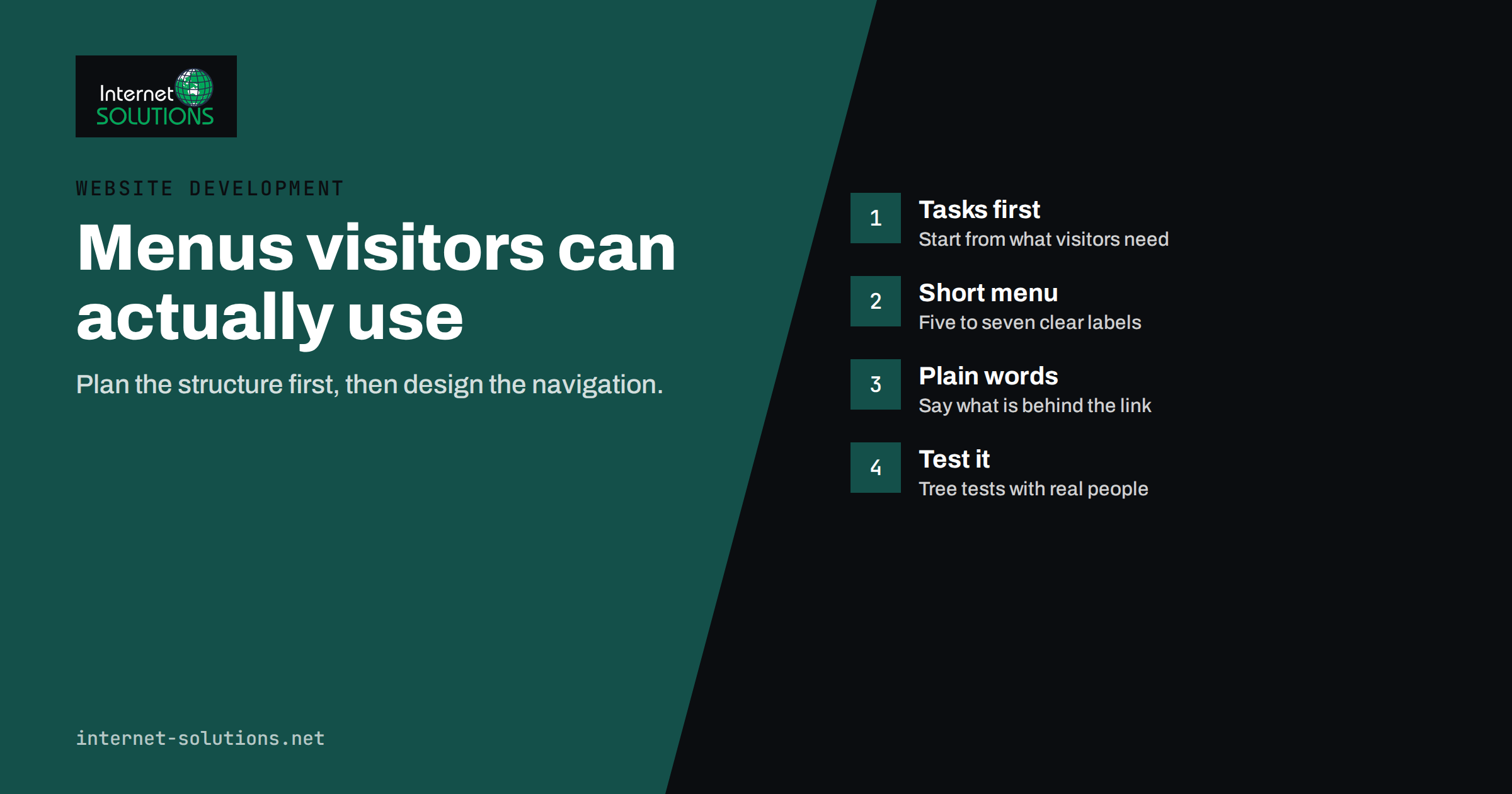
Visitors rarely read a website from top to bottom. They arrive with a question, look for a sign that they are in the right place and then try to find the next step. If the menu and structure help them, they stay. If not, they leave, usually without telling you why. Navigation is therefore not decoration around the content. It is the interface through which the content is found, and it affects conversions, support requests and search visibility alike.
Good navigation starts well before the menu is designed. It starts with information architecture, the decisions about what pages exist, how they are grouped and what they are called. This guide explains how to plan that structure, how to build menus that visitors can use on desktop and phone, how to label links so they are understood, and how to test the result before and after launch. It is written for business owners and project managers who commission or maintain websites, and it fits into the process described in our guide to planning a website project.
Information Architecture and Navigation: Two Different Jobs
People often use the two terms as if they meant the same thing, but they describe different layers. Information architecture is the underlying organisation of the content: which pages exist, which belong together and how they relate. Navigation is the set of controls that exposes that organisation, such as the main menu, footer links, breadcrumbs, search and links inside content. The Nielsen Norman Group explains the distinction clearly in its article on information architecture versus navigation. A weak architecture cannot be rescued by a clever menu, and a strong architecture can be hidden by a poor one.
Work in that order. Decide the structure first, then design the navigation that reveals it.
Start With Visitor Tasks, Not Your Org Chart
Most business websites mirror the company: a page for each department, product line or internal team. Visitors do not think that way. They think in tasks and questions: “What does this cost?”, “Do you work in my area?”, “Can you fix this problem?”, “How do I contact someone?” The structure should answer those questions in the visitor’s own words.
Begin with a list of the top tasks. Collect them from real sources:
- Questions asked by phone, email and chat, including transcripts if you use live chat.
- Search Console queries that bring people to the site.
- Internal site search terms, if the site has a search box.
- Sales conversations, which show how customers describe their needs before they know your terminology.
- Competitor sites, to see common conventions rather than to copy.
Rank the tasks by how many visitors need them and how valuable they are to the business. The top five or six usually define the main menu.
Group Content With Card Sorting
Once the pages are listed, the question is how to group them. Card sorting is a cheap and effective way to learn how real users group content. Write each page or topic on a card, ask a handful of people to sort them into groups that make sense to them and to name each group. Where several people create the same groups, you have a strong signal. Where they disagree, the content may be ambiguous or belong in more than one place, and cross-links will be needed.
You can do this with paper cards in a meeting room or with an online tool. Five to ten participants from your real audience are enough to find the main patterns. The Nielsen Norman Group describes ways to test navigation and information architecture, including tree testing, which checks whether people can find items in a proposed structure before any design exists.
Keep the Main Menu Short and Predictable
The main menu should help people decide where to go in a few seconds. Short menus are easier to scan, and predictable ones are easier to trust.
- Aim for five to seven top-level items. This is a guideline, not a law, but long lists force visitors to read everything.
- Put the most important destinations first, and place the main call to action, such as Contact or Get a quote, in a visually distinct position.
- Keep the order and wording consistent across all pages. A menu that changes between sections creates doubt.
- Use dropdowns carefully. A short dropdown for a service category can work, but deep nested menus are hard to use with a mouse and harder with a finger.
- Make the top-level item clickable. If the parent opens only a dropdown, people who click it get nothing, and search engines find no landing page for the section.
Label Links in Plain Words
Labels carry most of the weight of navigation. A visitor decides in a moment whether a word matches their need.
| Weak label | Better label | Reason |
|---|---|---|
| Solutions | Website development, SEO, IT support | Names the actual services instead of a general category |
| Resources | Blog, Guides, Pricing | “Resources” hides what is inside |
| Learn more | See SEO packages | Link text should describe the destination |
| Synergies | How we work | Avoid jargon that visitors do not use |
| Get started | Request a quote | Says exactly what happens next |
Use the words customers use, even when internal teams prefer other terms. Search data and customer emails show which words are common. Keep labels short, avoid cleverness and test them with someone who does not know your business.
Plan the Hierarchy and Depth
A flat structure keeps important pages close to the home page, while a deep one buries them. As a rule, visitors and search engines should be able to reach any key page within three clicks from the home page. This is not an absolute limit, but pages that sit many levels deep are discovered less often, receive fewer internal links and tend to perform worse.
A typical service business structure might look like this: home, then a services section with a page for each service, a section for case studies or products, a blog, an about page and a contact page. Each service page links to related guides, and each guide links back to the relevant service. This pattern also supports search visibility, as described in our guide to internal linking for SEO.
Beyond the Main Menu
The header menu is only one part of navigation. Several other elements deserve planning.
- Footer links. Use them for secondary pages that people expect to find: contact details, privacy policy, terms, careers and key service links. Avoid turning the footer into a long list of every page.
- Breadcrumbs. On sites with more than two levels, breadcrumbs show where a page sits and give an easy route up one level.
- Search. Sites with many pages or products benefit from a visible search box. Review the search terms regularly, because they show what visitors fail to find.
- Related links inside content. A paragraph that mentions a service should link to its page. This is often the most natural form of navigation.
- Calls to action. A clear next step at the end of each page prevents dead ends.
- Utility links. Login, cart, language selector and phone number need a consistent, recognisable place.
Design Navigation for Phones
Most visitors see your site on a phone, where the menu usually collapses into a button. This changes the rules. Make the menu button easy to see and tap, keep the list readable without zooming and give links enough space that a finger can hit them. Place the most important action, such as a phone call or contact link, where it is quick to reach. Avoid hover-only behaviour, since touch screens have no hover. Our article on mobile-first web design covers the other common mistakes in phone layouts.
Make Navigation Accessible
People who use keyboards, screen readers or zoom depend on navigation that is built correctly. Use real links and buttons, not clickable elements without semantic meaning. Make sure the menu can be reached and operated with the keyboard, that the focus is visible, that the order of items is logical and that dropdowns do not trap focus. Provide a “skip to content” link so keyboard users can bypass the menu. Good contrast and clear labels help everyone. For the wider picture, see our guide to WCAG compliance for business owners.
Test Before and After Launch
Navigation is easy to judge badly from the inside, because the team already knows where everything is. Test with people who do not.
- Tree test the structure before design. Give participants tasks, such as “find out how much a maintenance plan costs”, and see whether they choose the right branch.
- Run a five-second test on the home page: can a new visitor say what the site offers and where to go next?
- Observe a few real users trying common tasks on the prototype or the live site. Ten minutes of watching reveals more than a week of debate.
- Check analytics after launch. Look at menu click patterns, search terms, exit pages and the paths to the contact page. A page that is important but rarely reached has a navigation problem.
- Review twice a year. Content grows, services change and menus tend to accumulate items. Remove or merge what no longer earns its place.
Navigation and SEO
Navigation affects search visibility in several ways. Links in the menu pass authority to the pages they point to and help crawlers find important content. Clear structure supports sitelinks and helps search engines understand which pages are central. A logical hierarchy also supports topic coverage, since related pages sit together and link to each other.
Avoid practices that harm discovery: menus that exist only as scripts that search engines cannot follow, pages reachable only through search forms, and orphan pages with no internal links at all. When you restructure, plan redirects from old addresses, as explained in our guide to migrating a website without losing SEO rankings.
Common Navigation Mistakes
- Too many top-level items, which makes every item harder to notice.
- Vague or invented labels that visitors must decode.
- Different menus in different sections, which breaks the sense of place.
- Hiding the contact route, or making it hard to find on phones.
- Mega-menus that list everything, which move the problem from the page to the dropdown.
- Dead ends: pages with no next step and no related links.
- Designing for the company, not for the visitor’s tasks.
If you are planning a new site or a redesign, our website development team begins with exactly this structure work, so that design and content are built on a plan that has been tested.
Frequently Asked Questions
What is the difference between website navigation and information architecture?
Information architecture is how content is organised and related, while navigation is the set of controls, such as menus, links, breadcrumbs and search, that lets visitors move through it. You plan the architecture first and then design the navigation to expose it.
How many items should a main menu have?
Five to seven top-level items works for most business sites. More is possible if the labels are clear and the groups are logical, but long menus make each item harder to notice, especially on phones.
How many clicks should it take to reach any page?
Aim for key pages to be within three clicks of the home page. The number itself matters less than whether the path is obvious, but pages buried deep in the structure are found less often by visitors and search engines.
Should I use a mega-menu?
Only for large sites with many categories, such as big online stores. Even then, keep groups clear and avoid listing everything. For most service websites, a simple menu with a short dropdown or none at all works better.
How do I test whether my navigation works?
Give people who do not know the site a few typical tasks and see whether they find the right pages. Tree testing and short observation sessions with five to ten users reveal most problems, and analytics and site search data show what real visitors struggle with.
How often should I review the site structure?
Review it at least twice a year and after any major content or service change. Remove outdated items, merge overlapping pages and check that new content has a place and internal links pointing to it.
The Bottom Line
Strong website navigation is the visible result of good information architecture. Start from the tasks visitors want to complete, group content the way they would, keep the main menu short and predictable, label links in plain words and provide support elements such as breadcrumbs, search and clear calls to action. Build for phones and for keyboard users, test the structure with real people before and after launch and review it regularly as the site grows. A site that is easy to move through earns more trust, converts more visitors and gives search engines a clear picture of what matters.