

 English
 Lietuvių
 Latviešu
 Eesti
Eesti Русский
 Polski
 Українська
 Deutsch
 Italiano
 Español
 Français
 Português
 Čeština
 Magyar
 Română
 Ελληνικά
 Türkçe
 日本語
日本語 العربية
 हिन्दी
 Bahasa Indonesia
 Bahasa Melayu
 ไทย
ไทย Tiếng Việt
 বাংলা
বাংলাCheckout Optimization for Online Stores: Cut Abandonment Step by Step
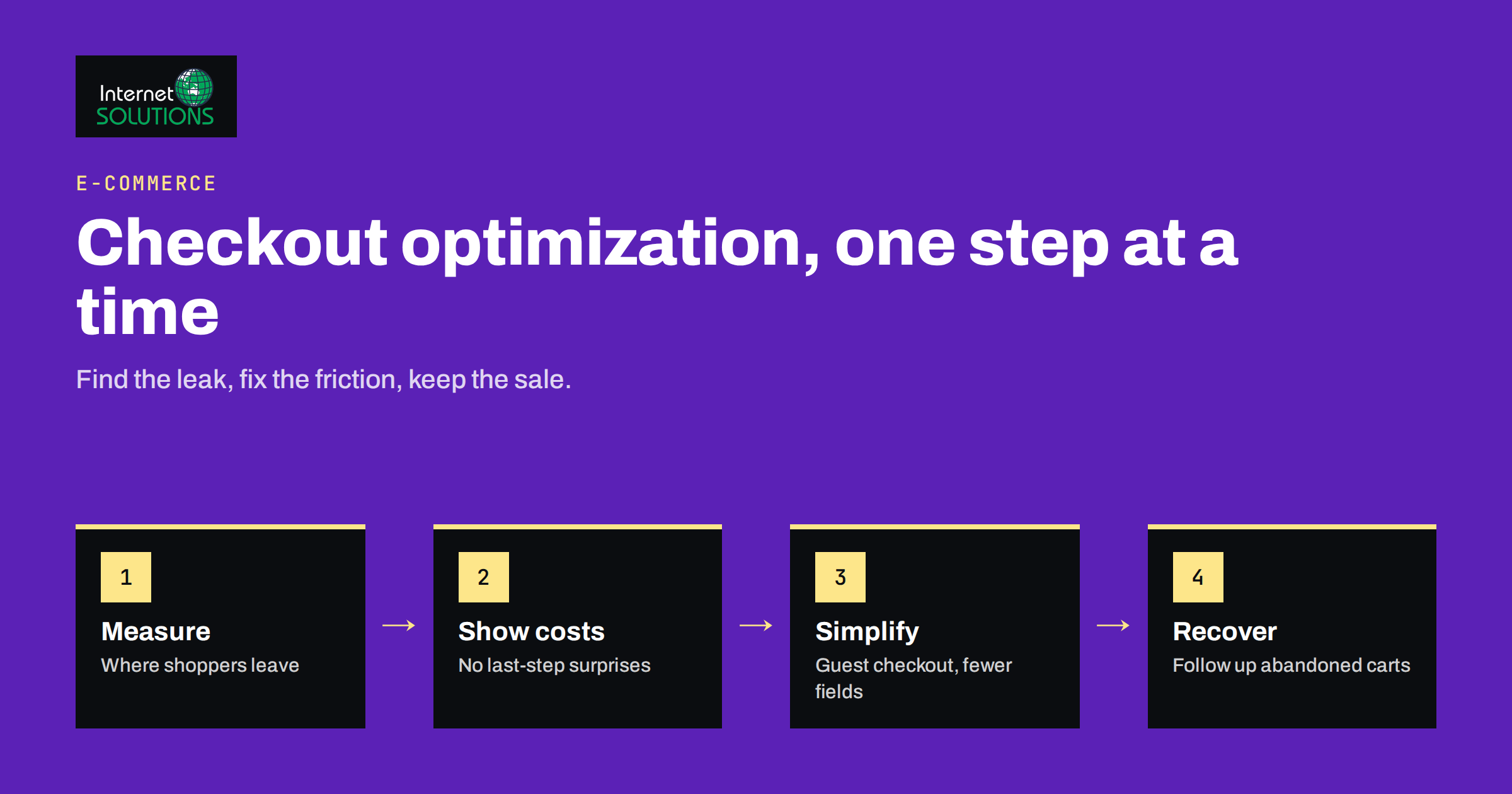
Checkout optimization is the work of removing every unnecessary obstacle between a shopper who has decided to buy and a completed order. It is often the highest-return improvement an online store can make, because the visitors reaching the checkout have already been paid for: you spent money or effort on search, ads, email or social media to bring them there, and they have already chosen a product. Losing them at the last step wastes all of that.
This guide walks through a practical, step-by-step approach to checkout optimization for online stores. It covers how to measure where shoppers leave, the main reasons for abandonment, the changes that usually help most, how to treat mobile checkout, payment and trust and how to test changes without guessing. It is the kind of analysis our website development team does when we build or improve e-commerce sites.
Measure the Funnel Before Changing Anything
Optimization starts with knowing where people leave. A typical purchase funnel has these steps: product page, add to cart, cart view, checkout start, shipping details, payment, order confirmation. Track each step as an event, so that you can see how many shoppers move from one step to the next.
- Look for the biggest drop between adjacent steps. A sudden fall at the shipping step suggests cost or delivery surprises; a fall at payment suggests trust, errors or missing payment methods.
- Split the funnel by device. Mobile and desktop often behave differently, and a mobile problem can hide behind a healthy overall average.
- Split by traffic source, new versus returning customers and country. A checkout that works for domestic buyers may be confusing for international ones.
- Record payment errors and form validation errors. They are direct evidence of friction.
Reliable measurement matters more than elaborate dashboards. If your events are missing or duplicated, your decisions will be wrong. Our guide on conversion tracking that holds up explains how to set up purchase and checkout events correctly in GA4 and Google Tag Manager.
Why Shoppers Abandon Checkout
Large-scale research on checkout usability is collected by the Baymard Institute, whose published findings on cart abandonment put the average at roughly seven in ten carts. Not all abandonment is a problem. Some shoppers are comparing prices, saving items for later or checking delivery costs. But a large share is caused by avoidable friction, and the reasons repeat across stores.
| Common reason | What shoppers experience | Typical fix |
|---|---|---|
| Unexpected extra costs | Shipping, taxes or fees appear only at the last step | Show delivery costs early, state free-shipping thresholds on product and cart pages |
| Forced account creation | A password is required before paying | Offer guest checkout, and invite account creation after the order |
| Long or complicated process | Too many pages, fields or repeated questions | Remove optional fields, group steps clearly, show progress |
| Lack of trust | Unfamiliar brand, unclear security, vague policies | Show recognised payment logos, clear contact details, returns and privacy information |
| Slow or uncertain delivery | No clear delivery date or options | Show estimated delivery dates and realistic options |
| Payment failures | Card declined, no preferred method, errors without explanation | Add common local methods, give clear, specific error messages |
| Technical problems | Slow pages, broken buttons, layout issues on phones | Test on real devices, fix performance, monitor errors |
Step 1: Show the Full Cost Early
Surprise costs are among the most consistent causes of abandonment. Do not wait until the final page to reveal shipping, taxes and fees. Show an estimate in the cart, or even on the product page, with a simple delivery calculator or a clear statement such as the free-shipping threshold. If you serve several countries, detect the location where possible and show prices in the right currency with taxes treated clearly.
Where costs genuinely vary, explain why. A short sentence next to the delivery price, for example, which carrier is used and when the order arrives, reduces hesitation.
Step 2: Offer Guest Checkout
Many shoppers will not create an account for a single purchase. Make guest checkout the default and put the login option for returning customers at the top, as a small, clear link. After payment, offer to save the details by adding only a password, since the shopper has already given their name and address. This keeps the first order frictionless and still builds your customer base.
Step 3: Remove Fields and Steps
Every field is a small cost. Audit your form and remove everything you do not need to fulfil the order.
- Ask for a company name, a second address line or a phone number only if they are needed, and mark them optional otherwise.
- Use a single full name field if your fulfilment process allows it.
- Let the billing address default to the shipping address, with a clear option to change it.
- Avoid asking for the same information twice, such as email confirmation fields.
- Put marketing consent in a clear, unticked checkbox, instead of a separate step.
Whether you use a single-page checkout or a multi-step one matters less than clarity. A multi-step checkout with a visible progress indicator and a summary of the order is often as effective as a single page. Test with your own audience if you can.
Step 4: Make Forms Easy to Complete
Form design is where small details create large gains.
- Use proper input types and autocomplete attributes so that browsers can fill in names, addresses and card details. The MDN reference for the autocomplete attribute lists the values.
- Show the right keyboard on phones for email, phone and numeric fields.
- Validate inline, as the shopper completes each field, and explain how to fix an error in plain language. “Enter a valid postcode, for example 12345” is better than “Invalid input”.
- Preserve what the shopper typed after an error. Clearing a form after a mistake is a quick way to lose an order.
- Use clear labels above fields, not placeholder text that disappears.
- Offer address lookup where it is available for your markets.
The web.dev guide to payment and address form best practices gives a detailed and practical checklist for these details.
Step 5: Treat Mobile as the Main Case
For many stores, most visitors browse on phones, so the mobile checkout is the checkout. Use large tap targets, a sticky order summary or a clear total, short forms and a visible primary button. Avoid pop-ups that cover the form, and make sure the page does not jump while loading. Test the entire flow on real phones with slow connections, including the payment step, since third-party payment pages can behave differently on mobile. For broader guidance on small screens, see our article on mobile-first web design.
Step 6: Offer the Payment Methods Your Customers Expect
Different markets prefer different payment methods: cards, bank transfers, local wallets, buy-now-pay-later services and digital wallets that fill in details with one tap. Look at your customers’ countries and add the methods that matter to them, rather than as many as possible. Too many options can also confuse. Make sure that:
- the payment method logos are visible before the final step,
- each method works smoothly, including on mobile and in the browsers your visitors use,
- failed payments produce clear messages and let the shopper try another method without starting over,
- 3-D Secure or other authentication steps are tested, since they can introduce failure points.
Step 7: Build Trust at the Moment of Payment
Entering card details is a moment of risk for the shopper. Reduce the doubt with real, specific signals instead of decorative badges.
- Use HTTPS everywhere and keep the page design consistent with the rest of the store.
- Show contact details, a returns summary and delivery information near the payment button.
- Display the payment providers you actually use.
- Include genuine reviews on product pages, not on the payment step where they can distract.
- Explain what happens next: confirmation email, tracking and support.
Avoid invented claims, such as a fake security seal or made-up customer counts. They damage trust and may break advertising and consumer-protection rules.
Step 8: Make Help Available Without Leaving the Page
Shoppers often hesitate because of a question: Will this arrive before the weekend? Can I return it? Does it work with my model? A chat that answers on the spot can save the sale. Our article on live chat for e-commerce shows how to use chat for pre-sale questions and cart recovery. Place help links where questions arise, and keep the chat widget from covering the checkout button on small screens.
Step 9: Follow Up on Abandoned Carts
Some shoppers will still leave. A well-timed reminder email can bring a portion of them back, provided you have their email address and consent. Keep the message helpful: show the items, state the total, link directly to the cart and answer common objections such as delivery and returns. A series of two or three emails, spaced out sensibly, usually works better than a single one. The structure is described in our guide to email automation flows. Respect privacy rules, and make unsubscribing easy.
Step 10: Test Changes Properly
Resist the urge to change everything at once. Make a list of improvements, order them by expected impact and effort, and implement them in a way that lets you see the results.
- Write a hypothesis, for example: “Showing the delivery estimate in the cart will reduce drop-off at the shipping step”.
- Choose one main metric, such as checkout completion rate, and a guardrail metric, such as refund rate.
- Run the test long enough to include full weekly cycles, and avoid launching during unusual periods such as big promotions.
- If your traffic is too low for statistical A/B testing, make one change at a time and compare periods carefully, and rely on session recordings and user feedback to understand why.
- Record the result and what you learned.
Qualitative research is valuable at low volumes. Watch recordings of real sessions, test the checkout yourself on different devices every month and ask a few recent customers what almost stopped them.
A Quick Checkout Audit Checklist
- Is guest checkout available and obvious?
- Are total costs and delivery estimates visible before the final step?
- Does the form ask only for what you need?
- Do autocomplete, input types and inline validation work on phones?
- Are the right payment methods offered, and do failures give clear messages?
- Is the page fast and free of layout shifts?
- Are returns, contact details and security information easy to find?
- Do you have funnel analytics and a cart recovery email?
If you want a professional review of your store’s checkout, you can contact our team to discuss it.
Frequently Asked Questions
What is a good checkout conversion rate?
It varies widely by industry, price, traffic quality and device, so compare your own store over time rather than chasing a single benchmark. Track the share of shoppers who start checkout and complete it, then look for the step with the largest drop.
Should I use a one-page or multi-step checkout?
Either can work. What matters is clarity: few fields, a visible order summary and a clear progress indicator. If you can test, compare them with your own customers, because results differ between stores.
Is guest checkout really necessary?
For most stores, yes. Forced account creation is a common reason for abandonment. Offer guest checkout by default and invite shoppers to create an account after they have paid.
How can I reduce abandonment caused by shipping costs?
Show costs early, offer a free-shipping threshold if your margins allow, give delivery options and explain the price. Surprises at the last step are the main problem, not the cost itself.
Do trust badges increase sales?
Genuine trust signals help, such as recognised payment providers, clear policies and contact details. Decorative or invented badges do not, and they can create legal problems. Use only claims you can support.
How do I know whether the problem is the checkout or the traffic?
Compare the funnel by source and device. If one source brings visitors who never add to cart, the issue is traffic quality. If shoppers add to cart and then leave at a specific checkout step, the issue is the checkout.
The Bottom Line
Checkout optimization is a series of small, evidence-based fixes: measure the funnel, show full costs early, offer guest checkout, remove unnecessary fields, make forms easy on mobile, support the payment methods your customers expect, build trust honestly, help shoppers with questions and follow up on abandoned carts. Change one thing at a time, measure the result and keep what works. Because the shoppers at checkout are already close to buying, even a modest improvement in completion rate can be worth more than a large increase in traffic.