

 English
 Lietuvių
 Latviešu
 Eesti
 Русский
 Polski
 Українська
 Deutsch
 Italiano
 Español
 Français
 Português
 Čeština
 Magyar
 Română
 Ελληνικά
 Türkçe
 日本語
 العربية
 हिन्दी
 Bahasa Indonesia
 Bahasa Melayu
 ไทย
 Tiếng Việt
 বাংলা
Service Pages That Convert: Structure, Proof and Calls to Action
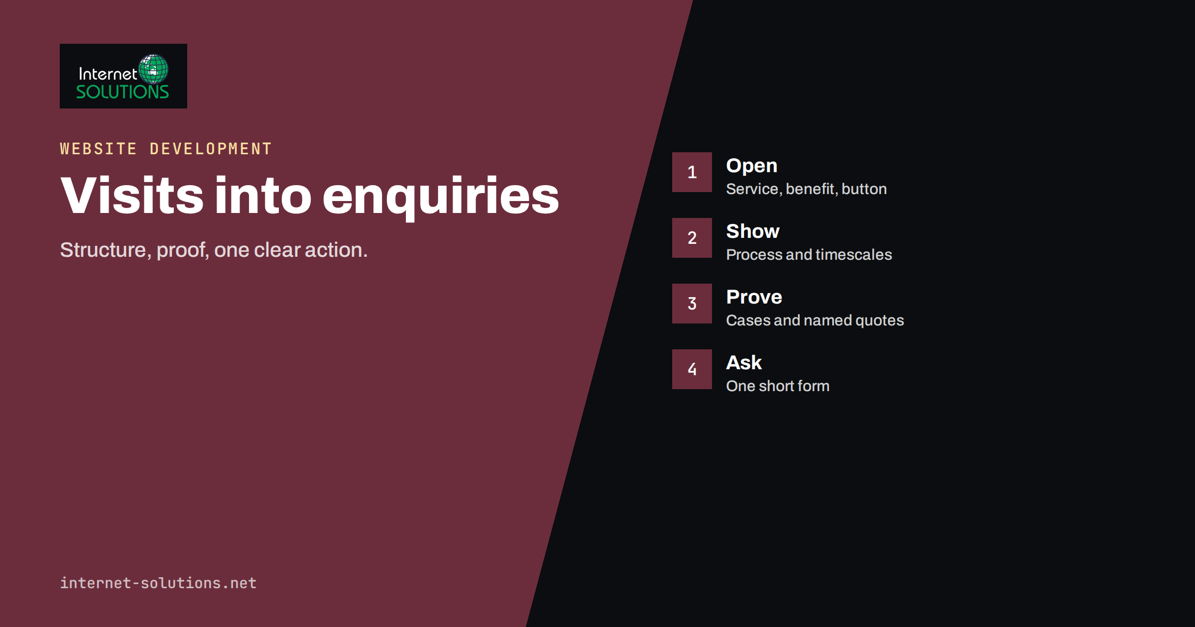
Service pages are the pages of a business website where a visitor decides whether to ask for a quote, book a call or leave. A homepage introduces the company, and a blog post attracts attention, but the service page carries the burden of persuasion: it must tell a stranger what you do, whether it fits their problem, why they should trust you and what to do next. Many service pages fail at all four. They open with a slogan, list features in the language of the supplier, bury the contact form at the bottom and rely on the visitor’s goodwill. The visitor, who arrived with a specific problem and little patience, goes back to the search results and clicks the next company.
This guide shows how to structure service pages that convert, section by section: the opening, the explanation of what is included, proof, answers to objections, the call to action and the details that make the page work on a phone and in search. The advice applies to a plumbing company, a law firm, an agency or an IT consultancy alike. It is a framework, not a template to copy, and every page should be tested against the real questions of your real customers.
Start With the Visitor’s Question
A person lands on a service page with a question in mind. It might be “Can you fix my problem?”, “How much will it cost?”, “How long will it take?” or “Can I trust you?” The page succeeds when it answers those questions in the order the visitor asks them, in words the visitor uses. Before writing, collect the real wording. Read emails and call notes, search your own enquiry form, look at the questions that appear in your live chat and read the reviews that customers leave. The phrases they use for their problem are the ones to put in headlines. A company that sells “managed infrastructure services” and a customer who types “my website keeps going down” are speaking different languages, and the page must meet the customer in theirs.
Decide, too, what one action the page is for. Most service pages should ask for one thing: an enquiry, a call, a booking or a quote request. A page with five competing buttons confuses the visitor and weakens the response.
The Structure of a Page That Converts
| Section | Purpose | What to include |
|---|---|---|
| Headline and opening | Confirm the visitor is in the right place | The service, who it is for, the main benefit and a clear first action |
| The problem | Show that you understand | Two or three sentences in the customer’s words |
| What you do | Explain the service | What is included, how it works and what the customer receives |
| Process | Reduce uncertainty | Three to five steps from enquiry to result, with timescales |
| Proof | Build trust | Results, case studies, testimonials, credentials, logos where permitted |
| Pricing information | Qualify and reassure | Ranges, starting points or what influences the cost |
| Answers to objections | Remove barriers | A short list of frequently asked questions |
| Call to action | Ask for the next step | One clear button, a short form and contact options |
The Headline and Opening
The first screen decides whether the visitor reads on. State the service in plain words and name the benefit. “Managed WordPress hosting with daily backups and a named engineer” tells a visitor more than “Empowering your digital future”. Add a short sentence about who it is for, such as “for small businesses that cannot afford downtime”. Place one visible call to action near the top, for example “Request a quote” or “Book a free 20-minute call”, so that a visitor who is ready does not have to scroll. Avoid sliders and decorative images that push the text below the fold. If a picture is used, make it show the actual work or the people who do it.
Describe What You Do in the Customer’s Terms
List what is included in the service in short, concrete statements, and translate features into outcomes. “Weekly offsite backups” becomes “If something breaks, we restore your site from last night’s copy”. Mention what is not included, because honest limits build trust and reduce time wasted on mismatched enquiries. Use headings and short paragraphs, since people scan before they read, a pattern that the Nielsen Norman Group describes in its research on how users read on the web. Put the most important facts first, and keep jargon out, or explain it in a few words.
Show the Process
Much of the hesitation in buying a service comes from not knowing what happens after the first message. A simple process section answers that. For example: 1. You send a short brief. 2. We reply within one working day with questions and a fixed-price proposal. 3. We agree the scope and the schedule. 4. We deliver in stages, and you review each one. 5. We hand over, train your team and stay available. Add typical timescales, and be honest about the variables that change them. A clear process shows professionalism, and visitors who read it arrive at the call with better questions.
Proof: The Part Most Pages Skip
Claims cost nothing, and visitors know it. Proof is what makes them believable. Use the types of evidence that fit your business and your obligations.
- Case studies that describe the problem, the work and the result, with real numbers where possible. Our guide to case studies and testimonials explains how to collect and present them.
- Testimonials with the person’s name, role and company, and permission to publish. A quote without a name looks invented.
- Credentials such as certifications, memberships, partner status and years of experience, stated accurately.
- Numbers that are true and checkable, such as the number of projects, response times or customer retention. Avoid vague superlatives.
- Visible people. Names and photos of the team build trust, especially for small firms.
- Third-party reviews from platforms that customers already use.
If you cannot show client names for confidentiality reasons, describe the type of client and the outcome without identifying details, and make sure that you have the right to publish anything you show. Do not invent testimonials or inflate figures. Aside from the ethical and legal issues, such claims are often easy to spot.
Be Clear About Price
Price is the question that many service pages avoid, and visitors notice. You do not have to publish a fixed price list, but you should give enough information for a visitor to know whether you are in the right range. Options include a starting price, a range, a sample project with its cost or a description of what drives the price. This qualifies visitors and saves time on both sides. Our article on pricing pages for service businesses discusses how to show prices without losing enquiries.
Answer Objections With a Short FAQ
Every service has recurring doubts: Will it disrupt our operations? Who will I deal with? What if we are not happy? Is there a contract? Do you work with companies like ours? Add a short list of questions and answers near the end of the page, written from real customer questions. This also helps search visibility, because many of the questions match what people type into search engines, and marking up the questions properly lets search engines understand them. Keep each answer honest and brief, and link to a deeper page if the topic needs more space.
The Call to Action
A call to action is the point of the page, so make it easy to find and easy to use.
- Use specific button text. “Get a fixed-price quote” outperforms “Submit”, because it says what happens.
- Repeat it. Place it near the top, after the proof and at the end, with the same wording.
- Keep forms short. Ask only for what you need to respond: name, email or phone and a short description. Every extra field lowers the completion rate. Our guide to web form design shows how to reduce friction.
- Offer more than one way to reach you. Some visitors prefer a phone number or a chat, so show them.
- Say what happens next. “We reply within one working day” removes uncertainty.
- Reduce risk. A free initial conversation or a clear cancellation policy makes the first step easier.
Avoid pressure tactics such as fake countdowns or invented scarcity. They damage trust and may break consumer protection rules.
Design and Technical Details That Affect Conversion
- Mobile first. Most visits to service pages come from phones. Buttons must be large enough to tap, text must be readable without zooming and the form must be easy to complete. Guidance such as web.dev’s article on tap targets gives practical sizes.
- Speed. A slow page loses visitors before they read a word. Compress images and avoid heavy scripts.
- Consistent navigation. The visitor should be able to move to related services and back, and our guide to website navigation helps you plan it.
- Readable layout. Short paragraphs, descriptive subheadings, enough contrast and white space.
- Accessibility. Clear labels, alternative text for images, and keyboard-friendly forms help everyone and are often a legal requirement.
- Tracking. Measure form submissions, calls and clicks on the call to action, so that you can see what works.
Writing for Search Without Spoiling the Page
A service page should also be found. Use the main phrase customers search for in the title, the main heading and the opening text, in natural wording. Add the place, if you serve a local area. Write unique content for each service, and avoid duplicating the same text across pages with only the place name changed. Provide helpful depth, because Google’s guidance on creating helpful, people-first content rewards pages that actually serve the visitor. Link related services and supporting articles together, and make sure each service page can be reached in a few clicks from the homepage. If you need a structured approach to the whole site, our website development team can plan service pages that suit both visitors and search engines.
A Worked Example
A small IT support company has a service page titled “Our IT services”. It lists twelve technical terms, a stock photo of a handshake and a contact form with nine fields at the bottom. Enquiries are rare. The owner rewrites the page for one service: “IT support for offices of 5 to 30 people”.
The new page opens with a clear headline, a sentence about response times and a button that says “Get a support quote”. It describes the problems customers typically have in their own words, lists what is included and not included, shows a four-step onboarding process with timescales, adds two short case studies with real outcomes and three named testimonials, gives a price range and the factors that influence it, and ends with five questions and a form with three fields. Phone and chat options appear beside the form. The company measures the form completion rate and the call clicks, finds that most enquiries arrive from phones and adds a sticky call button. Within two months, the page produces several times as many enquiries, and the quality of the leads improves, because the price information filters out mismatched requests.
Common Mistakes
- Opening with a slogan instead of the service and the benefit.
- Describing features and not outcomes.
- Hiding the call to action at the bottom.
- Offering no proof, or proof that cannot be checked.
- Avoiding every mention of price.
- Asking for too much information in the form.
- Copying the same page for several services or towns.
- Ignoring the mobile experience.
Frequently Asked Questions
How long should a service page be?
Long enough to answer the visitor’s questions, and no longer. Simple services may need a few hundred words, while complex ones need more. Use headings so that visitors can find what they need.
Should I put prices on a service page?
Give at least a starting point, a range or the factors that influence the cost. It saves time for both sides and filters out enquiries that do not fit.
How many calls to action should a page have?
One primary action, repeated at sensible points. You can add a secondary option, such as a phone number, but avoid a page that offers many different goals.
Do I need a separate page for each service?
Usually yes. Separate pages let you speak to a specific need and rank for specific searches. Group very similar services, and avoid thin pages with little to say.
How do I know whether a page converts?
Track the share of visitors who submit the form, call or click the call to action, and compare pages. Change one thing at a time, and give each change enough time and traffic to show a result.
Can I use testimonials from clients without names?
Anonymous quotes are weak and can look invented. Ask for permission to use a name and role, or describe the client type and the outcome in a case study you can stand behind.
The Bottom Line
A service page converts when it answers the visitor’s questions in order: what you do, whether it fits their problem, how it works, why they should trust you, what it costs and what to do next. Open with a clear headline and one action, explain the service in the customer’s words, show the process, back your claims with real proof, give honest price information, answer objections and keep the form short. Check the page on a phone, measure the results and improve one section at a time.