

 English
 Lietuvių
 Latviešu
 Eesti
Eesti Русский
 Polski
 Українська
 Deutsch
 Italiano
 Español
 Français
 Português
 Čeština
 Magyar
 Română
 Ελληνικά
 Türkçe
 日本語
日本語 العربية
 हिन्दी
 Bahasa Indonesia
 Bahasa Melayu
 ไทย
ไทย Tiếng Việt
 বাংলা
বাংলাEmail Design: Templates That Render in Gmail, Outlook and on Mobile
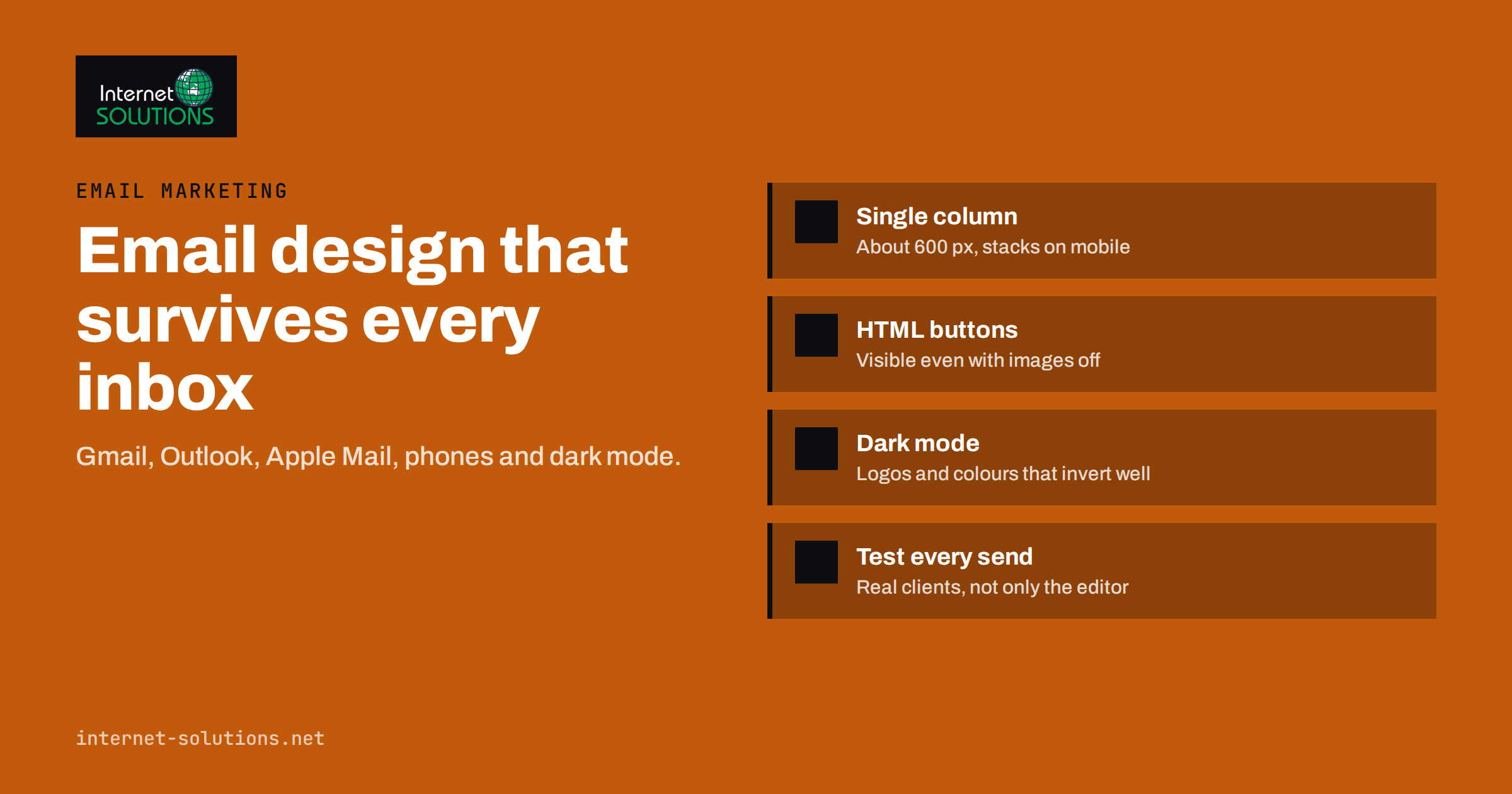
An email that looks perfect in the editor can arrive broken in half of your subscribers’ inboxes. Buttons turn into plain links, columns collapse into a mess, images do not load, and dark mode inverts the logo into an unreadable grey block. Good email design is not about making the prettiest template. It is about making a template that survives Gmail, Outlook, Apple Mail and a phone screen, and still gets the reader to the one action you care about.
This guide covers the practical side of email design: why email rendering is so different from web design, how to structure a template that holds up, how to handle images, buttons, fonts and dark mode, and how to test before you send. It is written for marketers and small business owners who send newsletters and campaigns, and for the developers who build their templates.
Why Email Design Is Harder Than Web Design
A website is displayed by a handful of modern browsers that follow the same standards closely. An email is displayed by dozens of different programs: webmail services, desktop applications and mobile apps, each with its own rendering engine and its own rules about which HTML and CSS it accepts. Some strip out style blocks, some ignore modern layout methods, and some rewrite your code before showing it.
The best-known example is desktop Outlook for Windows, which for many years used the Word rendering engine to display HTML emails. That engine does not support many common CSS properties, which is why email developers still use tables for layout long after the web moved on. Microsoft’s newer Outlook apps behave more like browsers, but many businesses still run the older desktop version, so templates need to handle both.
The site Can I email tracks which HTML and CSS features each email client supports. It is the most useful single reference when deciding whether a technique is safe to use.
What this means in practice
- Use simple, proven structures rather than the newest CSS.
- Put important styles inline on elements, because some clients ignore style blocks in the head.
- Design so that the email still makes sense if images are blocked or styles are partly lost.
- Test in real clients, not only in the preview of your sending tool.
The Anatomy of a Template That Holds Up
A single column at about 600 pixels
The most reliable layout is a single centred column, traditionally around 600 pixels wide on desktop and full width on phones. More than half of email opens typically happen on mobile devices, and a single column needs no rearranging on a small screen. Two-column sections are possible, but they should stack into one column on mobile.
A clear hierarchy
Each email should have one main message and one primary call to action. A typical structure is a small header with the logo, a headline, a short introduction, a hero image if it adds meaning, the body content, the main button, secondary links and a footer with the address and unsubscribe link. Readers scan emails in seconds; if the purpose is not obvious from the top third, most will not scroll to find it.
Readable text
Body text of around 16 pixels on mobile, line height of about 1.5, short paragraphs and strong contrast between text and background. Avoid long blocks of centred text, which are harder to read. Headlines can be larger, but keep them short enough not to wrap into four lines on a phone.
The inbox view is part of the design
Design starts before the email is opened. In the inbox, the reader sees only the sender name, the subject line and the preheader. Use a recognisable sender name, such as the company name or a person at the company, and keep it consistent between campaigns. Write a subject line that states the benefit in plain words, and use the preheader to add a second reason to open rather than repeating the subject. On phones, subjects longer than about forty characters are often cut, so put the important words first. A well-designed template that nobody opens has no effect at all.
Images, Buttons and Fonts
Images
Many email clients block images until the reader allows them, and some readers never do. Treat images as enhancements, not as the message. Every important image needs descriptive alt text, and the text around it should carry the meaning on its own. Never send an email that is one large image with all the text inside it: it is invisible when images are blocked, inaccessible to screen readers, and more likely to be treated as spam.
Compress images before sending and use the correct dimensions. A 3 megabyte hero image slows loading on mobile data and helps nobody. Retina-quality images should be saved at twice the displayed size and scaled down with width attributes, but still compressed.
Buttons
A button made of an image disappears when images are blocked. A button made with HTML and CSS survives. The common technique, often called a bulletproof button, uses a table cell or a padded link with a background colour, so it renders in nearly every client. Litmus has a detailed guide to bulletproof email buttons. Make buttons large enough to tap with a thumb, at least around 44 pixels high, and use a verb that says what happens next.
Fonts
Custom web fonts work in some clients and not in others. Always specify a fallback stack of system fonts, and check that the design still looks right with the fallback, because a large share of your readers will see it. Never put important text in an image just to use a particular font.
Dark Mode Without Surprises
Many readers use dark mode on their phones and computers, and email clients handle it differently. Some leave your email untouched, some invert only light backgrounds, and some invert all colours. The result can be a dark logo on a dark background, or a brand colour that turns into something unrecognisable.
- Logos: use a transparent PNG with a subtle light outline or a version designed to work on both light and dark backgrounds.
- Colours: avoid pure black text on pure white, which some clients invert harshly; slightly off-black and off-white often behave better.
- Images with text: avoid them where possible, because they will not adapt.
- Dark mode styles: some clients support a media query for colour scheme, so you can provide specific dark mode colours; others ignore it, so design a template that is acceptable even when inverted.
Litmus maintains a thorough guide to dark mode for email that shows how each major client behaves.
How Major Email Clients Differ
The table summarises the areas that most often cause problems. Support changes over time, so treat it as a guide to what to test rather than a permanent rule.
| Area | Gmail (web and app) | Outlook desktop for Windows (older versions) | Apple Mail (iPhone and Mac) | Safe approach |
|---|---|---|---|---|
| Layout | Good support for tables and most CSS | Tables needed; limited CSS | Very good CSS support | Table-based single column |
| Style blocks in head | Supported with limits | Partly supported | Supported | Inline critical styles |
| Web fonts | Limited | Not reliable | Supported | Always set system font fallbacks |
| Background images | Supported | Needs special code | Supported | Solid colour fallback behind every image |
| Dark mode | Partial or full inversion | Varies by version | Respects dark mode styles | Design to survive inversion |
| Email size | Clips messages over about 102 KB of HTML | No clipping | No clipping | Keep HTML lean |
The Gmail clipping limit
Gmail cuts off messages whose HTML code exceeds roughly 102 kilobytes and shows a “View entire message” link. Anything below the cut, including the unsubscribe link and tracking pixel, may never be seen. Heavy templates from drag-and-drop editors often hit this limit. Minify the code and remove unused sections.
Accessibility Is Part of Good Email Design
Accessible emails reach more people and usually perform better for everyone. The principles are the same as on the web; the W3C’s writing tips for web accessibility are a good starting point.
- Set the language attribute in the HTML so screen readers pronounce the text correctly.
- Use real headings rather than bold paragraphs, so the structure can be navigated.
- Write alt text that describes the purpose of each image, and leave decorative images with empty alt text.
- Keep link text meaningful: “Download the price list” rather than “click here”.
- Check colour contrast, especially for text on brand-coloured backgrounds.
- Mark layout tables with a presentation role so screen readers do not announce them as data tables.
Testing Before Every Send
A template should be tested thoroughly once when it is built and quickly before every campaign. A practical pre-send checklist looks like this:
- Send test emails to real accounts in Gmail, Outlook and Apple Mail, on desktop and on a phone, or use a rendering preview service that shows dozens of clients at once.
- Check with images turned off. Is the message still clear? Is the button still visible?
- Check dark mode on at least one phone.
- Click every link and confirm tracking parameters are present and landing pages load.
- Read the preheader text, the short line shown after the subject in the inbox. If it is empty, clients fill it with whatever text comes first, often “View in browser”.
- Check the size of the HTML against the Gmail clipping limit.
- Confirm authentication so the email reaches the inbox at all. A beautiful template in the spam folder is wasted; our guide to SPF, DKIM and DMARC explains the setup.
Once templates render reliably, you can start testing design choices against each other, such as button colour, image versus no image, or long versus short layouts. Our article on email A/B testing explains how to run those tests and read the results without fooling yourself.
Building a Reusable Template System
Designing each campaign from scratch is slow and error-prone. A small system of tested components works better: a header, a headline block, a text block, an image block, a button, a two-column product block that stacks on mobile, and a footer. Each component is tested once in all major clients. New campaigns are assembled from these components, so the risk of a broken layout drops dramatically and the team can produce campaigns faster.
Keep the system documented: colours, font sizes, spacing, button styles and rules for images. When a new team member or agency builds a campaign, the email still looks like your brand. If you would rather have this built and maintained for you, it is part of our email marketing service.
Frequently Asked Questions
What is the best width for an email design?
Around 600 to 640 pixels for the main content column on desktop remains the safest choice, with the layout switching to full width on mobile screens.
Why does my email look different in Outlook?
Older desktop versions of Outlook for Windows use a rendering engine with limited CSS support. Table-based layouts, inline styles and bulletproof buttons are the standard way to make templates render correctly there.
Should I design emails for dark mode?
Yes. Many readers use dark mode, and some email clients invert colours automatically. Use logos that work on dark backgrounds, avoid text inside images and test on at least one device in dark mode.
Can I use custom fonts in email design?
Some clients display web fonts, but many do not. Use them only as an enhancement and always define a fallback stack of system fonts that keeps the design readable.
Why does Gmail cut off my email?
Gmail clips emails whose HTML is larger than about 102 KB. Reduce the code size by removing unused sections, minifying the HTML and avoiding bloated editor output.
Is plain text email better than designed HTML email?
Neither is always better. Plain-looking emails often work well for personal, one-to-one style messages, while designed HTML suits newsletters and product campaigns. Test both with your audience, and always include a plain text version alongside HTML.
The Bottom Line
Email design succeeds when the message survives the inbox, not when it looks good in the editor. Use a simple single-column structure, inline critical styles, HTML buttons, alt text for every meaningful image and a font fallback. Plan for dark mode and the Gmail clipping limit, test in real clients before every send and build a small system of reusable, tested components. Do that, and each campaign reaches readers looking the way you intended, with a clear path to the one action that matters.