

 English
 Lietuvių
 Latviešu
 Eesti
 Русский
 Polski
 Українська
 Deutsch
 Italiano
 Español
 Français
 Português
 Čeština
 Magyar
 Română
 Ελληνικά
 Türkçe
 日本語
 العربية
 हिन्दी
 Bahasa Indonesia
 Bahasa Melayu
 ไทย
 Tiếng Việt
 বাংলা
Website Wireframes and Mockups: Agreeing the Design Before Development
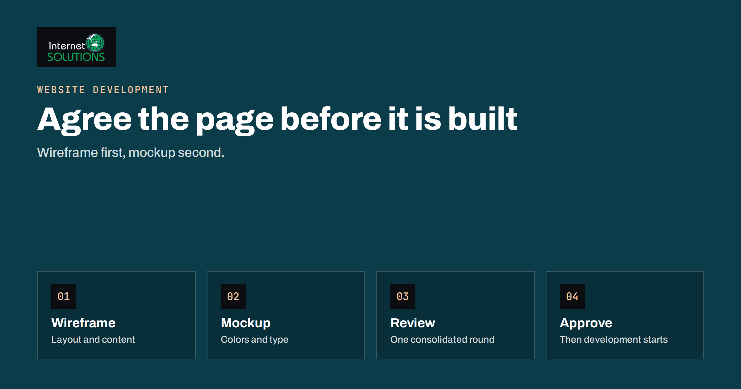
Website wireframes and mockups are the two drawings that decide whether a website project runs smoothly or turns into an expensive argument. A wireframe is a simple, black-and-white sketch of the layout and content of a page: where the headline, the image, the menu, the forms and the buttons go. A mockup is a realistic picture of the finished design, with colors, fonts, images and real text. Agreeing both before anyone writes code means that you argue about boxes and pictures, which are cheap to change, and not about working pages, which are not. This article explains how wireframes and mockups differ, what to review at each stage, how to give feedback that helps and how to approve a design without regret.
It is written for business owners and managers who commission a website, redesign or new landing pages and want to stay in control of the result. You do not need design skills. You need a clear idea of what the site must do for your visitors and your business, and the discipline to review in the right order.
Why Design Approval Comes Before Development
Changing a drawing takes minutes. Changing a built page can take hours, because layout, scripts, content management and responsive behaviour all depend on each other. A change of mind after development is the most common reason for budget overruns and delays in website projects. Wireframes and mockups give everyone a shared picture early, so that misunderstandings appear while they are cheap to fix.
- They force decisions. What is the main message, which action do we want, what goes above the fold.
- They reveal missing content. You discover that a page needs a price table or a team photo that nobody has prepared.
- They protect the budget. The agreed design becomes the reference for the scope. Changes after approval are changes in scope.
- They help several people agree. A drawing is easier to discuss than a description.
Our guide to planning a website project from brief to launch places this stage in the whole project, and our website development service follows the same order.
Wireframes: Structure Before Style
A wireframe shows structure and priority without distractions. It typically uses grey boxes, placeholder images and simple labels, and it often includes real headlines and short text where they matter. By removing color and fonts, it makes people look at what is on the page and where.
A useful wireframe answers these questions for each key page.
- What is the purpose of this page? One main goal, such as requesting a quote, reading a guide or buying a product.
- What does the visitor see first? The headline, the supporting line and the main action, without scrolling.
- What is the order of the content? The sequence of sections, from the problem to the proof to the call to action.
- Where are the actions? Buttons, forms, phone numbers and links, and how often they repeat.
- How does the page behave on a phone? A mobile wireframe is not a squeezed desktop version, since the order of elements and the size of targets differ.
- How does the visitor move around? Menu items, footer links and links between related pages. Our articles on website navigation and information architecture and homepage design go deeper into these questions.
For background on the method, the encyclopedia entry on the website wireframe gives a short overview.
Mockups: Look and Feel
A mockup, sometimes called a visual design or comp, applies the brand to the approved wireframe: colors, typography, photography, icons, spacing and the style of buttons and forms. It shows what the site will look like, usually for at least the homepage and one inner page, on desktop and mobile. Some mockups are static images, and others are clickable prototypes that let you click through sample journeys.
When you review a mockup, look at questions that a wireframe could not answer.
- Does it look like your brand? Logo, colors and tone should match your guidelines.
- Is the text readable? Size, contrast and line length matter. The W3C publishes accessible design guidance, and its tips for designing for accessibility are a good checklist.
- Do the images fit? Placeholder photos are acceptable at this stage, but the style must be right, and you must have or plan to get the real ones.
- Do the actions stand out? The main button should be easy to see, and secondary ones should not compete.
- Does it work on a phone? Check the mobile mockup as carefully as the desktop one.
- Are the states shown? Hover, error messages for forms, an empty cart or a long headline can break a design that looks perfect with ideal content.
Wireframe or Mockup: What Each Is For
| Aspect | Wireframe | Mockup |
|---|---|---|
| Purpose | Agree structure, content order and actions | Agree visual style and brand fit |
| Look | Grey boxes, simple labels | Realistic colors, fonts and images |
| Speed to change | Very fast | Moderate |
| Best feedback | “Move the proof above the form” | “Use a darker button color for contrast” |
| Typical risk | Debating colors too early | Reopening structure at this late stage |
| Who should review | Owner, sales, support | Owner and brand lead |
| Output | Approved page structure | Approved design for development |
The Order of Review
The most useful rule is to review in sequence and not to mix levels. Do not comment on colors in a wireframe, and do not reopen the structure in a mockup unless there is a serious reason.
- Content and goals. Agree the list of pages and the purpose of each, and gather the real text and images.
- Sitemap and navigation. Confirm how pages are grouped and how people find them.
- Wireframes of key pages. Home, main service or product, contact, and one typical content page.
- Revisions and sign-off of wireframes. One consolidated round of comments, then approval.
- Mockups of the same pages. Desktop and mobile.
- Revisions and sign-off of mockups. Again one consolidated round.
- Development starts from the approved material.
How to Give Feedback That Helps
Feedback quality determines the schedule. The designer needs clear and consistent instructions, not a stream of opinions from many people.
- Consolidate. One person collects comments from the team and sends a single list. Contradictory requests from different people stop the project.
- Describe the problem, not just the fix. “I cannot find the phone number” is more useful than “make the phone number red”.
- Refer to the goal. Comments such as “this will not help visitors request a quote” are easier to act on than “I do not like it”.
- Be specific. Name the page, the section and the element.
- Separate must-haves from preferences. Mark which changes are necessary and which are optional.
- Test with someone outside the team. Show the wireframe to two customers or colleagues from another department and ask what they would click first.
- Check against real content. Replace “lorem ipsum” with real headlines and sample text before judging.
What Approval Means
Approval should be a clear, written step, not a casual nod. It means that you accept the structure or the design as the basis for development and that further changes may affect schedule and cost. To make it meaningful, do the following before signing off.
- Check every page type that will exist, not only the homepage. Surprises often appear on forms, product listings and blog pages.
- Check mobile views.
- Confirm that the legal and trust elements are included: privacy and cookie notices, contact details, company information and any required labels.
- Confirm the list of integrations, such as booking, payments, live chat and email forms.
- Agree who approves what, and in what time, so that the project does not stall on one person’s calendar.
After approval, protect the scope. Small refinements are normal, but new pages or different layouts should be handled as changes with their own estimate. When the site is ready, use the website handover checklist to confirm that you receive everything you should.
A Worked Example
A training company asks for a new website with a course catalog, a booking form and a blog. The owner and the designer agree the list of pages and the purpose of each. The designer produces wireframes for the homepage, the course page and the booking page. On the course page wireframe, the owner notices that the price and the dates are far below the fold and that the booking button appears only at the bottom. She asks for the key facts and a button near the top, and for a short list of benefits before the full description.
The team gathers comments in one document and approves the wireframes. In the mockup stage, they review color contrast, check that the button stands out, find that a long course title wraps badly on a phone and fix it. They also add an error state to the booking form. After sign-off, development starts with no big surprises, and the first working version matches the picture. A later request for a members area is handled as a separate piece of work with its own estimate.
Content Comes First: Real Text and Images
The most common reason a design review goes wrong is that it uses imaginary content. A page that looks balanced with three short lines may break with a real paragraph, and a layout that works for a four-word headline fails for a twelve-word one. Before the wireframe stage, collect the real material for the key pages: the main headline and a short description of each service or product, the prices or at least the structure of the price information, the contact details, the team photographs, the logo files and any certificates or awards you want to show. If some content does not exist yet, agree who will write it and when, and use realistic examples in the meantime, not filler text.
It also helps to decide the priority of each piece of content. Ask: if the visitor reads only one thing on this page, what should it be? What should come second? The answer shapes the wireframe more than any visual decision does. Pages that try to give every item the same weight end up with no clear focus, and visitors leave without acting. Writing the priorities in a simple numbered list for each page, and checking the wireframe against it, is a quick and effective test.
Responsive Behaviour and Accessibility
Design is not fixed on a single screen size. Ask the designer to show how the layout changes on a tablet and a phone: where columns stack, what happens to the menu, which images are cropped and how wide tables are handled. Check that buttons and links are large enough to tap, that text can be enlarged without breaking the layout and that color is not the only way to show an important state, such as an error. These checks are cheap to make on a drawing and expensive to fix on a finished site, and they help every visitor, not only those with disabilities.
Common Mistakes
- Skipping wireframes and going straight to a pretty picture.
- Arguing about colors while the structure is still unsettled.
- Reviewing with placeholder text, then being surprised by real content.
- Collecting feedback from many people without one owner.
- Designing only the homepage and ignoring other page types.
- Forgetting the mobile design until development.
- Approving informally, so that the scope of changes is unclear.
Frequently Asked Questions
Do I need both wireframes and mockups?
For most business sites, yes. Wireframes settle structure and content order, and mockups settle the visual style. For a very small site, a combined stage may be enough, but keep the order of decisions.
How many rounds of changes should I expect?
One consolidated round per stage is a healthy target. More rounds usually mean that goals or content were not clear at the start.
Which pages need a design?
Design every distinct page type: homepage, main service or product, listing pages, content pages, contact and any forms. Similar pages can share a template.
Can I change my mind after approval?
You can, but changes after approval usually affect cost and schedule. Small refinements are normal, and new structures should be treated as a change request.
What tools are used for wireframes and mockups?
Designers use a range of design and prototyping tools. As the client, you only need a way to view and comment, such as a link or a PDF, and a clear list of pages.
Should I provide content before the design stage?
Yes, at least the main headlines and text for key pages. Real content reveals problems that placeholder text hides.
The Bottom Line
Website wireframes and mockups let you agree structure and style while changes are still cheap. Use wireframes to settle the purpose of each page, the order of content and the actions, then use mockups to settle colors, type, images and mobile design. Review in order, give consolidated and specific feedback, test with real content and people outside the team and make approval a written step that defines the scope. Done this way, development becomes the execution of an agreed plan, and the finished site looks like the picture you signed.